Mobile-responsive design
Project Summary:
Re-design online enrollment
Client:
City National Bank
Role:
UX Designer, Researcher, UI Designer
Problem:
Asked by business to re-design enrollment to online banking due to high rate of failures without identifying root cause
Objective:
-
Reduce number of failed enrollments
-
Increase number of successful enrollments
-
Improve accessibility and mobile responsiveness
Methods:
-
Heuristic analysis based on metrics
-
A/B Usability test
Deliverable:
Prototype for mobile-responsive web and mobile app


Enrollment - Before re-design
Team was asked to re-design enrollment for online banking due to high rate of failures in enrollment in system. Root cause was not identified by the business. We knew the failures were occurring on the first screen so we focused on the the copy and form fields highlighted below.

Analysis & Design
After conducting a thorough analysis on analytics on site use and conducting heuristic analysis, we found that a high number of failed enrollments due to:
-
Confusion of which input field to enter bank account number or card number
-
Invalid information entered
-
Attempts to re-enroll in online banking
I designed two prototypes, one with tabs and dropdown menu to select account type, and another with only a dropdown menu to select account type or card. I decided to conduct an A/B test to find out which version users preferred.
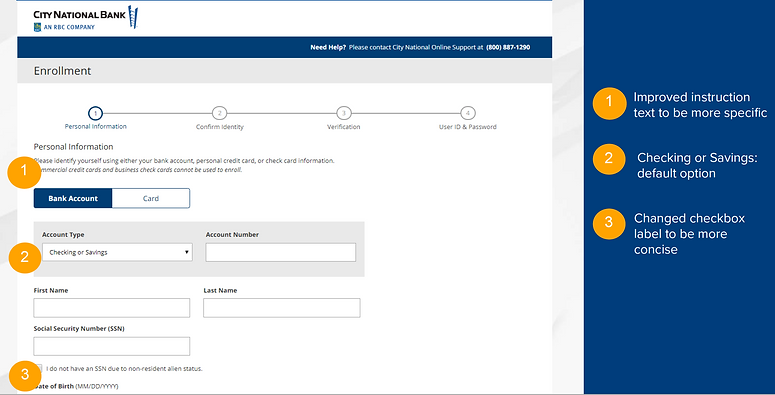
I changed the default in both prototypes to be Bank Account, as most users enrolled in online banking with either a checking or savings account. Other changes were made to the copy to be more specific or concise.
Version A: tabs + dropdown menu

Version B: dropdown menu only

Usability Study
Goal: Determine which interface users prefer based on usability
Testing Methodology
-
10 participants from Usertesting.com
-
Ages 35-55 years
-
Income $100,000+
-
A/B test
-
Focus: qualitative results
Qualitative Results: Preference Summary
Version A was preferred over version B:
-
Version A was found to provide easy access to the most frequent choices and to quickly compare the data required for each. Additionally, the visual design of A was found to be “cleaner”, “nicer”, and “more professional”.
-
Participants who preferred Version B liked that everything was in one place, but participant comments indicated only a slight preference and even some waffling toward A.
Quotes from users that preferred Version A
-
Want easy access to most likely / frequent choices
-
“I like the clickable boxes because you are going to use those more often than the others.”
-
“Quicker to navigate with having to go to a drop-down first.”
-
-
Want to quickly compare the choices
-
“I like having these horizontal individual boxes so I can just jump back and forth. I liked seeing all the options right in front of me.”
-
“It changes as you click on [tabs]” Using B, can’t quickly see how much information needed to enter for each one.
-
-
Better visual design
-
“Cleaner, more professional look”
-
“Tabs look nicer and cleaner.”
-
“I like the separation of the [tabs] rather than being squished into a drop-down.
-
“Whichever one I click on highlights in blue. I just love the layout.”
-
Follow-up questions:
1. Which account or card would participants use in real life?
5 participants would use their Checking Account
4 – Credit Card
1 – Check Card
0 – Loan
0 – Brokerage
0 – Trust
2. Which version do you prefer? (shown screenshots both side-by-side)
-
6 participants preferred Version A
-
4 participants preferred Version B
Enrollment - After re-design
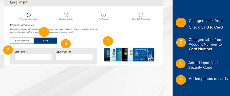
Since more users preferred Version A with the tabs, I chose the final design to include both tabs and dropdown menu and simplified both the Credit Card and Check Card into one tab "Card" since it was determined that the card type could be identified by the first 6 numbers of the card entered (BIN).
Card Enrollment
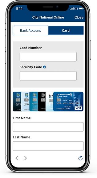
On the card tab, input field label was changed to be more consistent with the cards to "Card Number." As the user enters the first 6 numbers of the card number, animation of the cards on the right would change to display the visual of the card that matched the user's card number type.
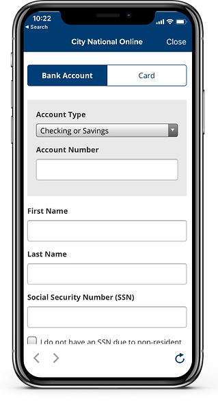
Mobile App
Summary: Improvements and Enhancements
-
Improved usability through analysis of most common way to enroll (checking account)
-
Add ability to open with Savings Account (explicit label)
-
Improved usability, including mobile responsiveness and accessibility of interactive elements by adding focus indicators and restricting valid input type
-
Improved visual elements (animated display of credit/check card of cardholder as enter first 6 numbers)
-
Improved copy and input labels to be more concise and accurate
-
Added validation to catch errors before submission
-
Restricted number of enrollment attempts for enhanced security
-
Enabled real-time enrollment for deposit accounts (backend)
Result
Comparing the total number of successful enrollments a year before launch of re-design and a year after launch, the difference was found to have increased total successful enrollments by 33% and 46% of processed enrollments (including manual enrollments completed by the bank) and reduced failure rate by 19%.
Key Learnings
Key learnings from this experience is that it is important to consider the user flow to optimize for the most common selections and user tasks. It is also important to account for common user errors and validate input before continuing the user flow.