Designing Learning Portal
Client: PriceWaterhouseCoopers (PwC)
Role: UX/UI Designer, UX Strategist, UX Researcher
Project: Design prototype of employee learning portal, first product within the firm to keep track of employees’ learning credits and credentials earned.
User Problem: Employees had to keep their own record of courses taken and credentials earned and search for relevant courses for their career growth on their own.
Team: Product, Solution Architect, Engineering, QA, UX Design
Tools and methods: Axure, Figma, Mural for Design thinking workshop and user testing
Deliverable: MVP Prototype that satisfies product requirements

User Flow
Product Requirements
After discussing the user flow with the product team, the flow is defined as following.
First, you must confirm your profile to make sure the information is correct, then answer questions about your role. The system will then automatically build a lesson plan based on your role and input. Then you select your interests and learning style. The system will then display a list of electives based on your input to choose from. Once you have selected electives, you can confirm your plan to save and return back to your lesson plan summary.

Design Thinking Workshop
Once the prototype screens were built based on the product requirements and user flow above, I facilitated design thinking workshops with PwC employees to determine if the user flow and user interface were intuitive.
User Scenario
As an employee of PwC, you would like to update your learning plan to make sure you are on track for your learning goals. Your personal assistant AI tool “Astro” gives you suggested actions which include updating your learning plan. For each screen, participants were asked the following questions.
-
What information catches your attention first?
-
What does this information mean to you?
-
What would you do next?
After participants gave their feedback on each screen, they were asked the following questions.
-
Was the overall flow intuitive? Were there any parts that were confusing?
-
Did you understand the information being presented?
Prototype Screens
Once the prototype was built based on product requirements, I facilitated design thinking workshops with business stakeholders to determine if the flow and user interface was intuitive.
Employee/learner views their schedule on Astro, their AI assistant. A notification to update their learning plan displays. Once they click “Update Plan” button, they will be asked to confirm the profile information in the system to ensure it is correct.

First, they must confirm their profile to make sure the information is correct, then answer questions about their role.

Once they click the "Get Started" button, they will be taken to their Plan Summary and receive a notification message if they were recently promoted.

The system will then automatically build a lesson plan based on their role and input.

Learner selects interests.
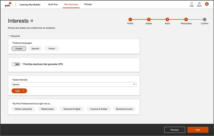
Select learning style such as what device they will use, length of course, and type of content.

The system will then display a list of electives based on their input to choose from.

Selected elective shown under My Selections tab. User clicks “Update Plan” button to add selections.

Once they have finished selecting electives, they can confirm their plan to save by clicking “Acknowledge Plan” button.

Learner returns back to their lesson plan summary.

Feedback and Re-design
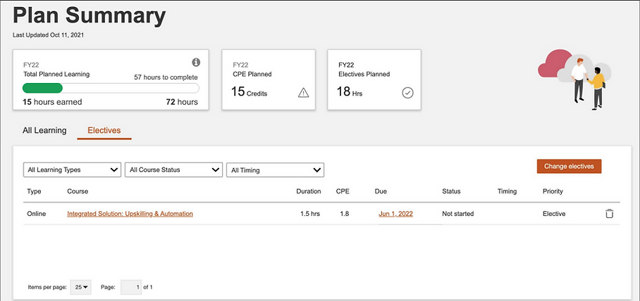
Some feedback from users was that they would like to know how much more hours they need to fulfill their learning requirement. Instead of 2 separate numbers, hours of Total Planned Learning and Earned so far, 15 out of 72 hours of learning earned would be more helpful. A visual representation such as a progress bar would be helpful, added below. I also added the calculation of number of learning hours to be completed above the progress bar. Since number of hours Earned is added to the first section, I removed the last section of hours Earned so far to consolidate the numbers.
Another suggestion from users was that they wanted to see something more visually congratulatory like confetti when they received the message congratulating them on their promotion. I added an animated gif of confetti in the modal below.